Stages & Challenges in the Process
There are 7 stages to this publication in both print and digital design. It began from early brand concept and reference of travel magazines, then I had to add uniqueness into the brand and its content to make it stand out from the genre.
Editorial Mandate + Brand + Readership
Stage 1: Rather than appealing to general public, I had to narrow down and be specific on a target group and magazine's purpose.
This definition of the brand allowed me to review my design in later stage to see if it matched the meaning and impression of "Soul Packer".
Soul Packer is a low-budget travel magazine targeting 24 - 40 year-old backpackers and people who are in life stress and look for a healing trip to find themselves again. With an issue published two-monthly, each covers backpackers’ journey on a country or city and how they find and embrace themselves and others during the journey. Every issue includes content of one specific country or city, news on latest traveller gadgets and more stories from unforgettable experience. There are four additional special holiday issues dedicated to readers’ sharing of own travel stories. The magazine aims to inspire and encourage travel for healing, recovering from daily stress.
Healing is about both body and soul. This magazine focuses on the healing process of tired souls in city life through travelling. Backpacking is a travel style that backpacker wanders freely, communicates and experiences the local culture in a slower pace. “Soul Packer” combines “soulful” and “backpacking” to define this magazine which promotes soul-healing and searching in slower-pacing journey. It is also Soul Packer’s goal to let readers learn and understand the cultures, find both peace and excitement through the stories from their busy city life.
- Gender Split: Male and Female equally
- Age: Majority between 24-40
- Median Income: around $50000
- Sample Occupation Types: Athletes, teachers, office clerk, photographers, university students
- Average Education: at least a university degree
- Geographic Location: Metropolitan cities in North America
- Brands/Products/Activities: travelling, backpackers, hikers, photography, documentaries, nature, local stories and explorers, accommodations, food
The target reader is young, adventurous being curious about the exotic, natural places in different countries and its culture. He/she loves to communicate, listen to heart-warming stories, excites about knowledges and uniqueness in foreign cultures, enjoys travelling freely, knows how to appreciate the culture and spirit of the city. He/she prefers backpacking in low-budget and collects experience.
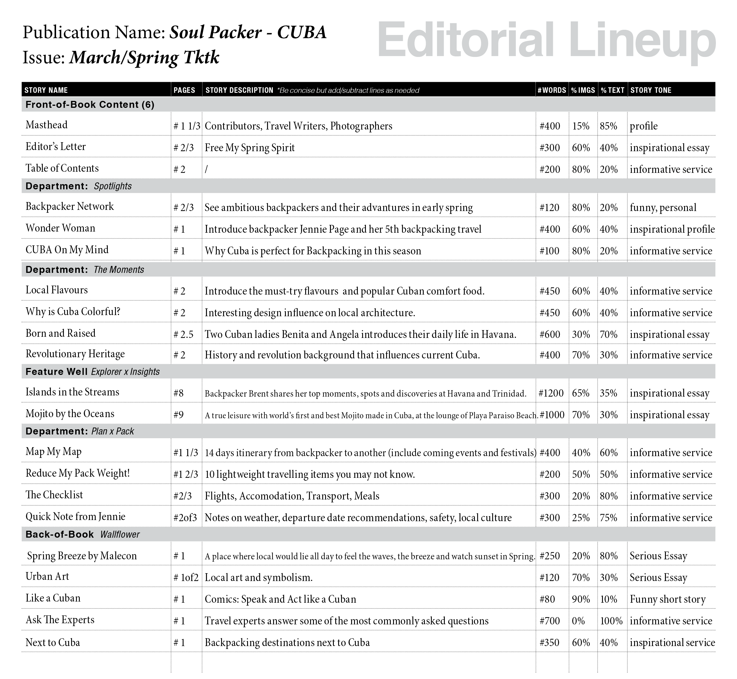
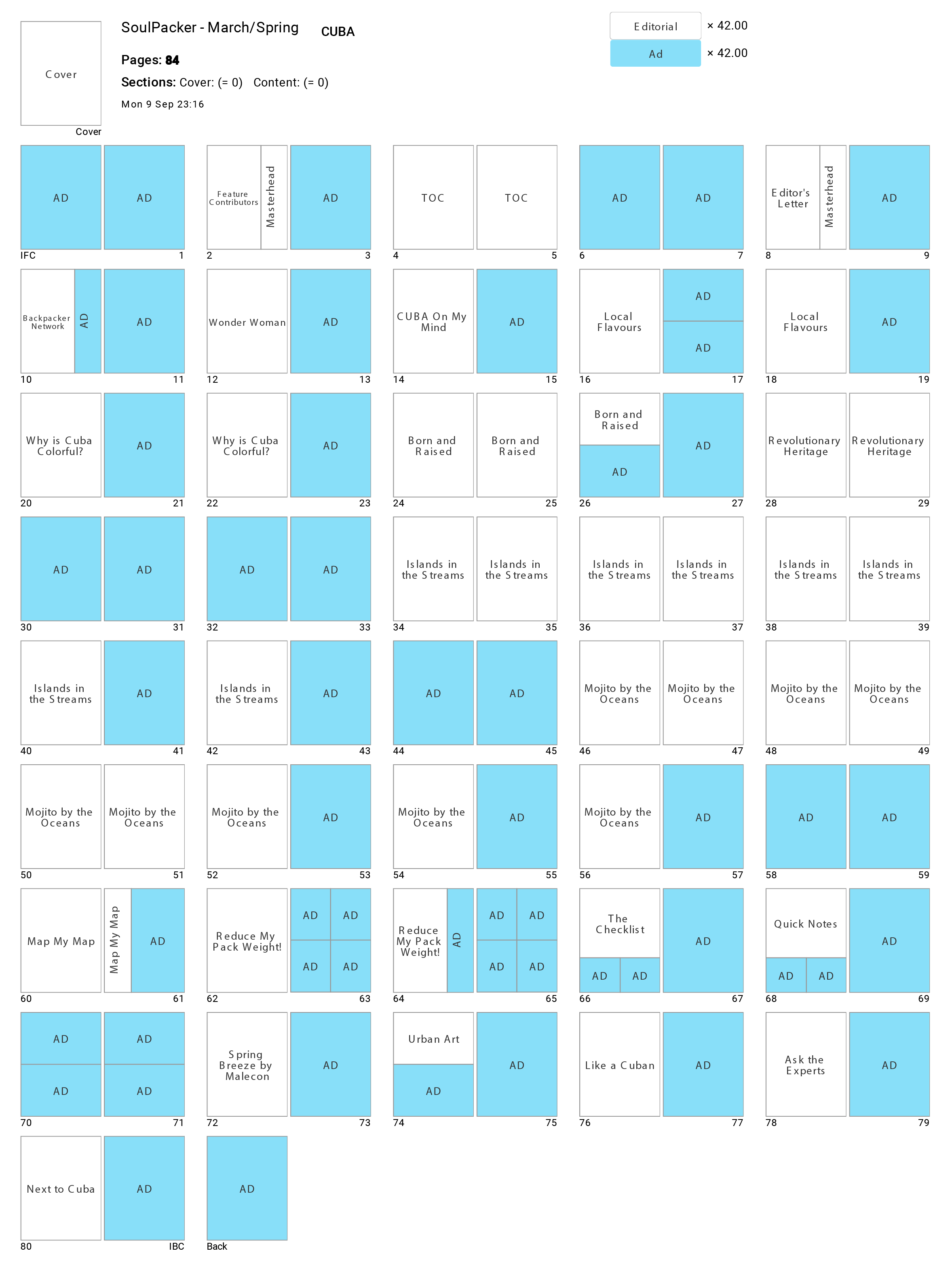
Editorial Lineup + Flatplan
Stage 2: As each issue focuses on one particular city, I put thoughts into what readers might be interested in reading first to last if they were attracted to the stories in the city.
I believe having a variety of traveller content with diverse story ideas, length, tone and style would be more interesting to read. It would be more photo-driven as visual support/ evidence for the stories.
To draft the flatplan, I focused about the balance between editorial content and ads, and also overall flow/ sequence of stories.
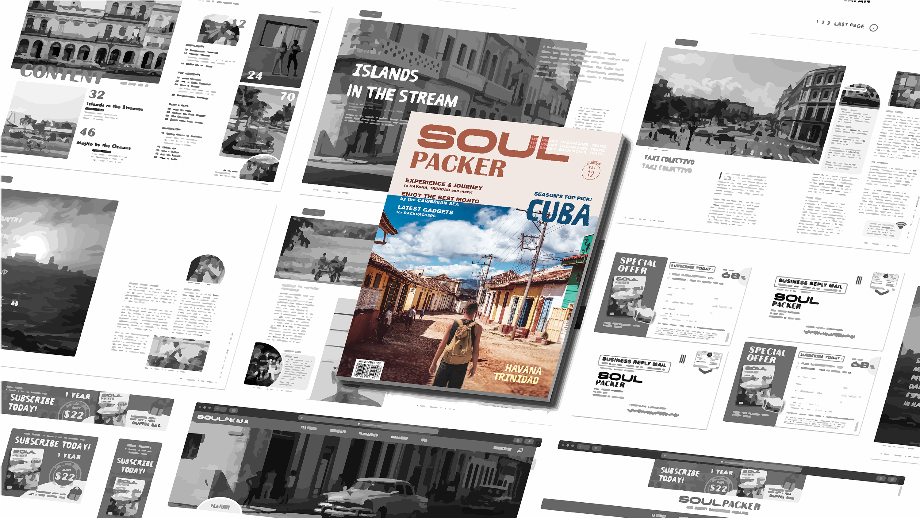
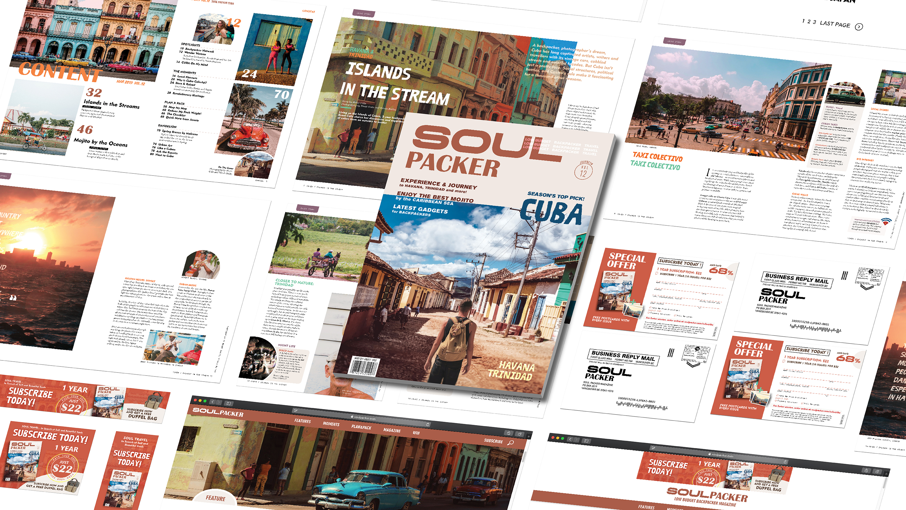
Cover Design
Stage 3: The goal of the cover is to attract and speak its theme and branding through strong logo, image of feature story and headlines.
One major issue found in early designs is that the image choice neither conveyed issue theme, brand concept of low-budget backpacking travel, nor invite audience to discover more.
Due to another struggle in finding suitable image, I changed the issue theme from Japan to Cuba and started all over again.
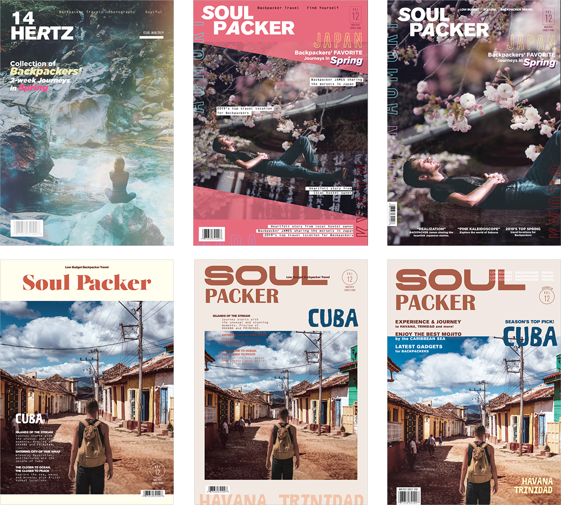
c h a l l e n g e # 1 — Logo and Typography
The word “Soul” gives me a feeling of slow and pure enjoyment of oneself and “Packer” has more action and movement. Therefore, I took an unusual way — used different, contrasting typography in brand in attempt to show the combination of both “feelings” in one.
- “Soul” uses a long, smooth, thick type to represent the heaviness of soul, like people would hardly leave for travel for all the life reasons.
- “Packer” uses a more playful serif font that creates a relatively great contrast with soul.
c h a l l e n g e # 2 — Image Selection & Treatment
I specifically looked for images with traveller wearing backpack, walking in Cuba, and attractive elements like the colours in Cuba that readers can immediately connote that that is Cuba. Since I could not find one that matches all these criteria, I find two photos and combine it in Photoshop.
- A image of a couple walking in Cuba
- A image of a man standing along in the middle of the street
Extra challenge on image treatment is to make cover line more legible. Therefore, I also edited out some clouds on left and wires across the background to make the image more clean and less distraction.
Editorial Layout Design: Print and Digital Adaptations
Stage 4: I had to use online traveller blogs to mock editorial content. I also picked images to create a layout with consistent composition that shows clear rhythm and hierarchy.
After print version was finished, I did two digital mockups of feature story post and video content page using Adobe X.
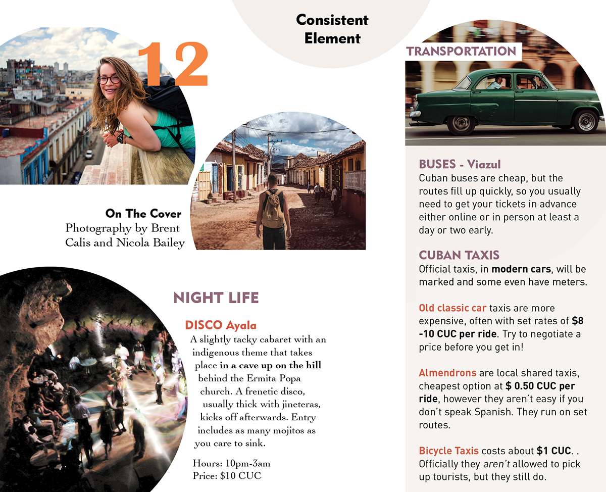
c h a l l e n g e # 3 — Consistent styling in print and web
Apart from layout, typography and colour, I wanted to include element to connect both print an web.
- I put small corners/ notes in a round text-box to separate from body content as special tips for vehicle, music, attractions, etc.
- I used a lot one-side full bleed image to let readers know they are still reading the same editorial article and have not reached the end after 6 consecutive pages.
- Digital Adaption: I included exclusive online content like video play and small paid post column to demonstrate the placement and look of the magazine subscription ads.
Table Of Content
Stage 5: I followed the overall art direction in editorial and cover design. I paid attention to the grid and hierarchy,a nd also how image placement could be used to guide audience to feature stories first and create a flow in reading.
Business Reply Card
Stage 6: I aimed to give a clear branding, contact form, distinctive, concise and time-sensitive call-to-action subscription offer. As it has a set size, I lean to focusing on the use of space in this small card and the content strategy to encourage subscriptions.
Online Display ADs
Stage 7: Different from BRC, I designed the ads with a striking imagery, a big clear offer and button, and minimal text in order to state our brand and offers in the most clear, attracting way.
c h a l l e n g e # 4 — Campaign Offer and Design
Thinking in more a marketing perspective, I did two different campaigns in online and print respectively to match what audience might attract to in different platforms.
Print: BRC with Postcard Gifts
Travel magazines usually contain high-quality aesthetic images and I believe people might be interested in keeping a couple of them. Postcard can be put as wall art and it is something highly collectable.
Digital: Ads with Duffle Bags
As online ads are more reachable by public other than target audience, I believe a free bag will be more attractive for travellers, as well as the more useful part of a quality travel bag.