This is a web design team project from Web Design & Development course. In teams of two, we can choose an existing company to work from styleguide, wireframe, sitemap to actual coding.
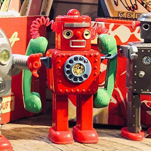
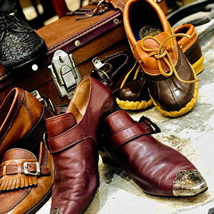
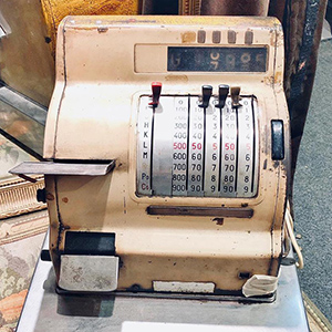
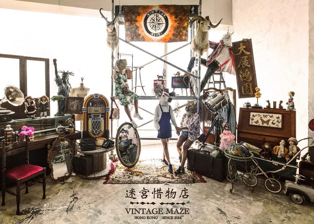
We chose Vintage Maze, a vintage boutique with collections around the world, antique furniture, home-ware, pre-loved clothing, accessories, toys & other vintage collectables.
Designed, Codeed by Alison Chan, Nicole Chan.
My Role
I did the initial site structure, styleguide and wireframe. After Nicole joining the team, I am in charge of whole homepage, product pages and all form layouts.
Skills & Tools
Coding: HTML, CSS, Java Script
Software: Sublime Text (Coding), GitHub (Communication)
Planning & Design
Before working as a team, I had to create sitemap, wireframes and styleguide so my teammate could have a clear guide and visual design when we coded the whole website together.
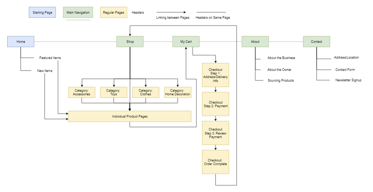
Sitemap
With reference to other shopping site, I began with planning the website structure to clarify the links and pages to be developed.
As this project is aimed to help user achieve five goals, the structure is relatively less complex yet I had to keep in mind of the three-click rule.
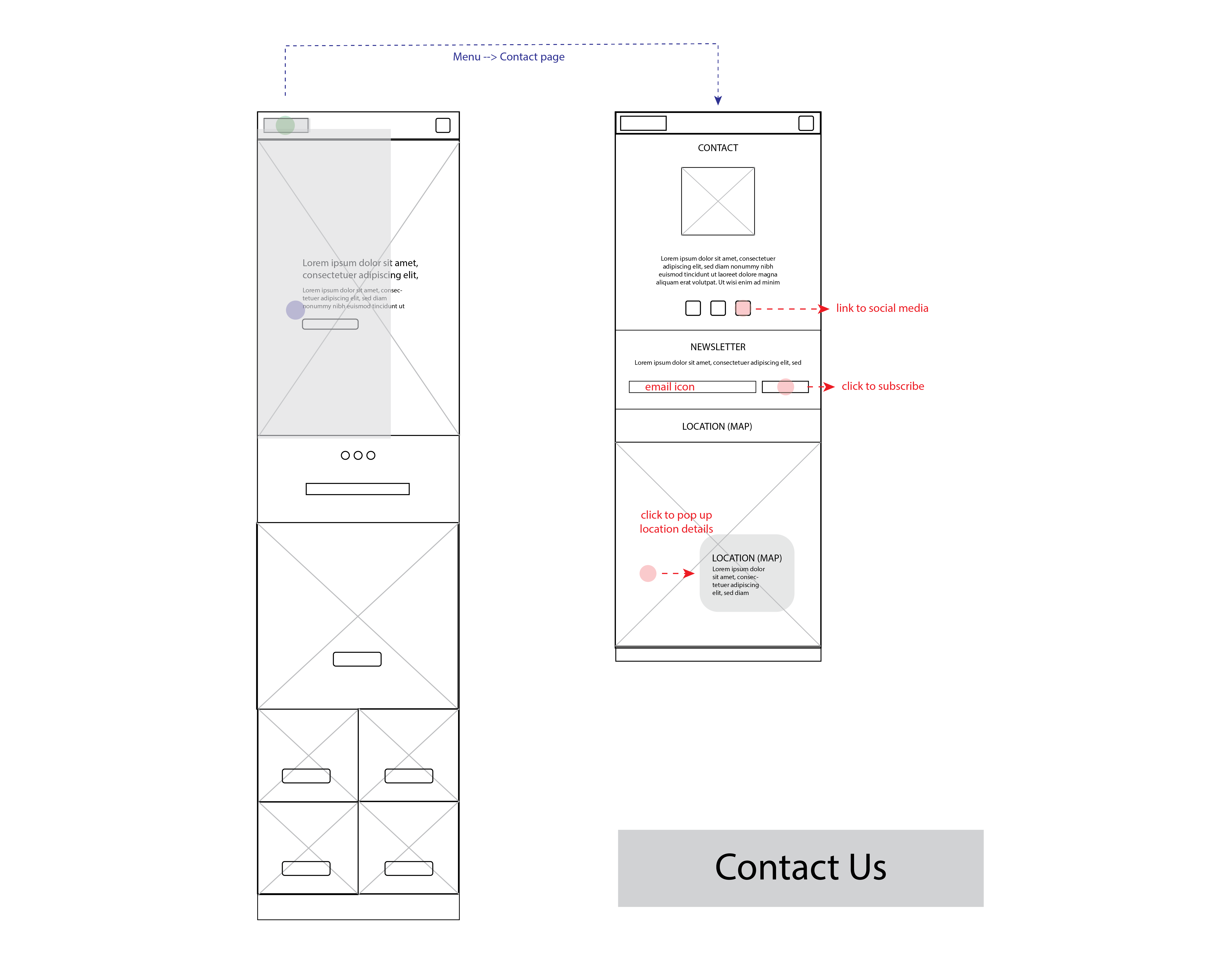
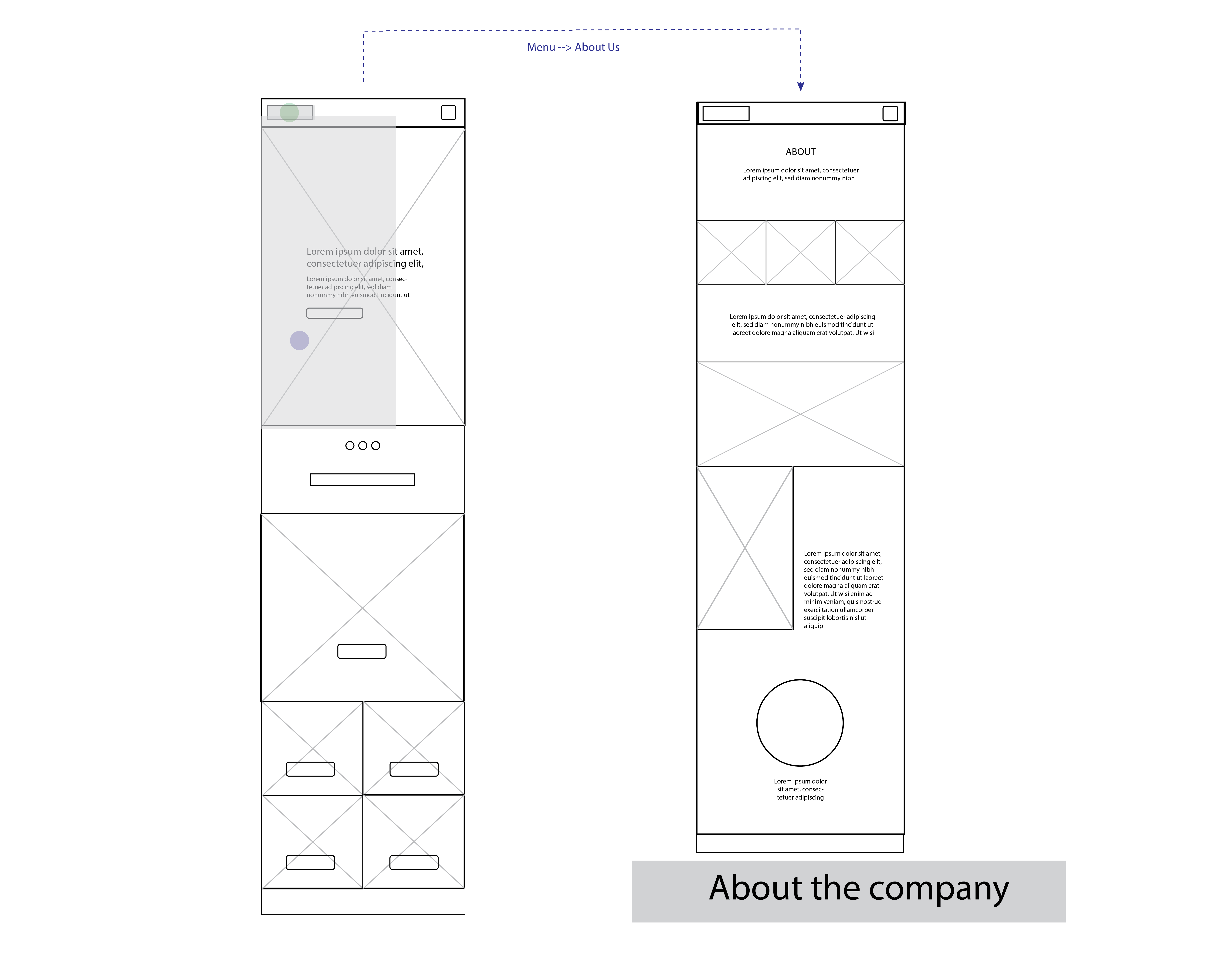
Include 5 main services: Offers checking, product review and purchase, store information and contact information
Webpage to have: Homepage, Product Category, Product Detail, About, Contact, Shopping Cart, Checkout/Payment Transaction Process
SiteMap of Vintage Maze
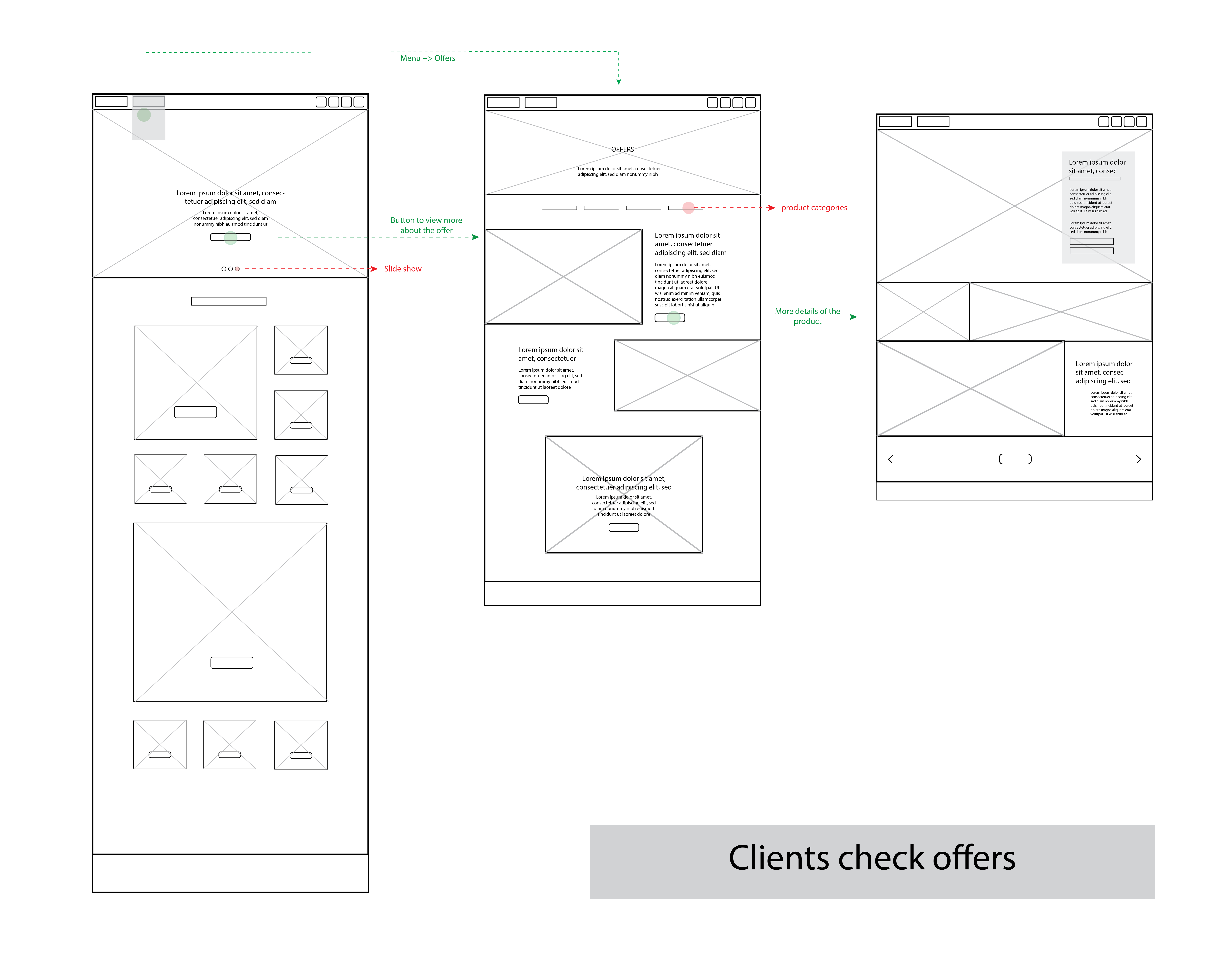
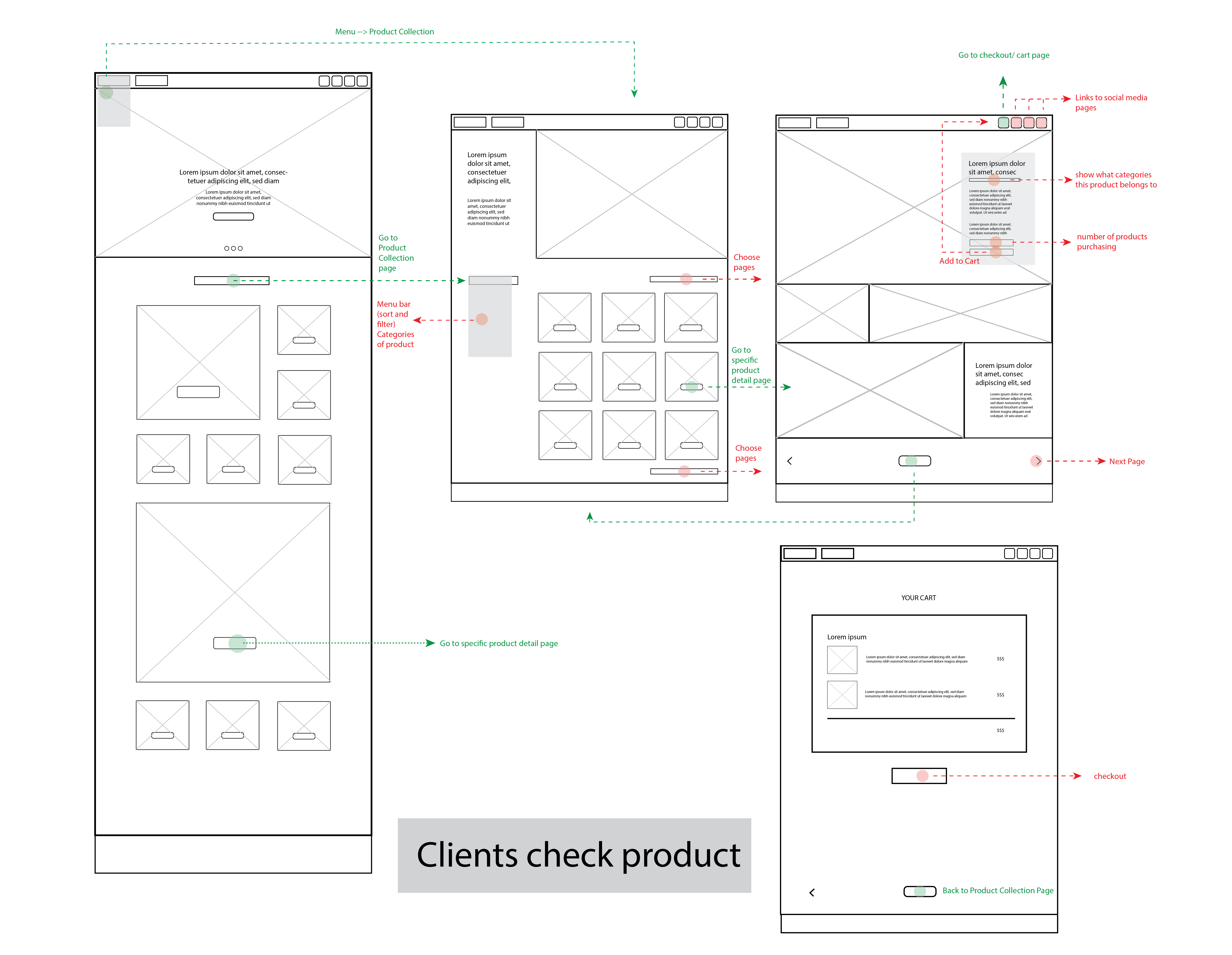
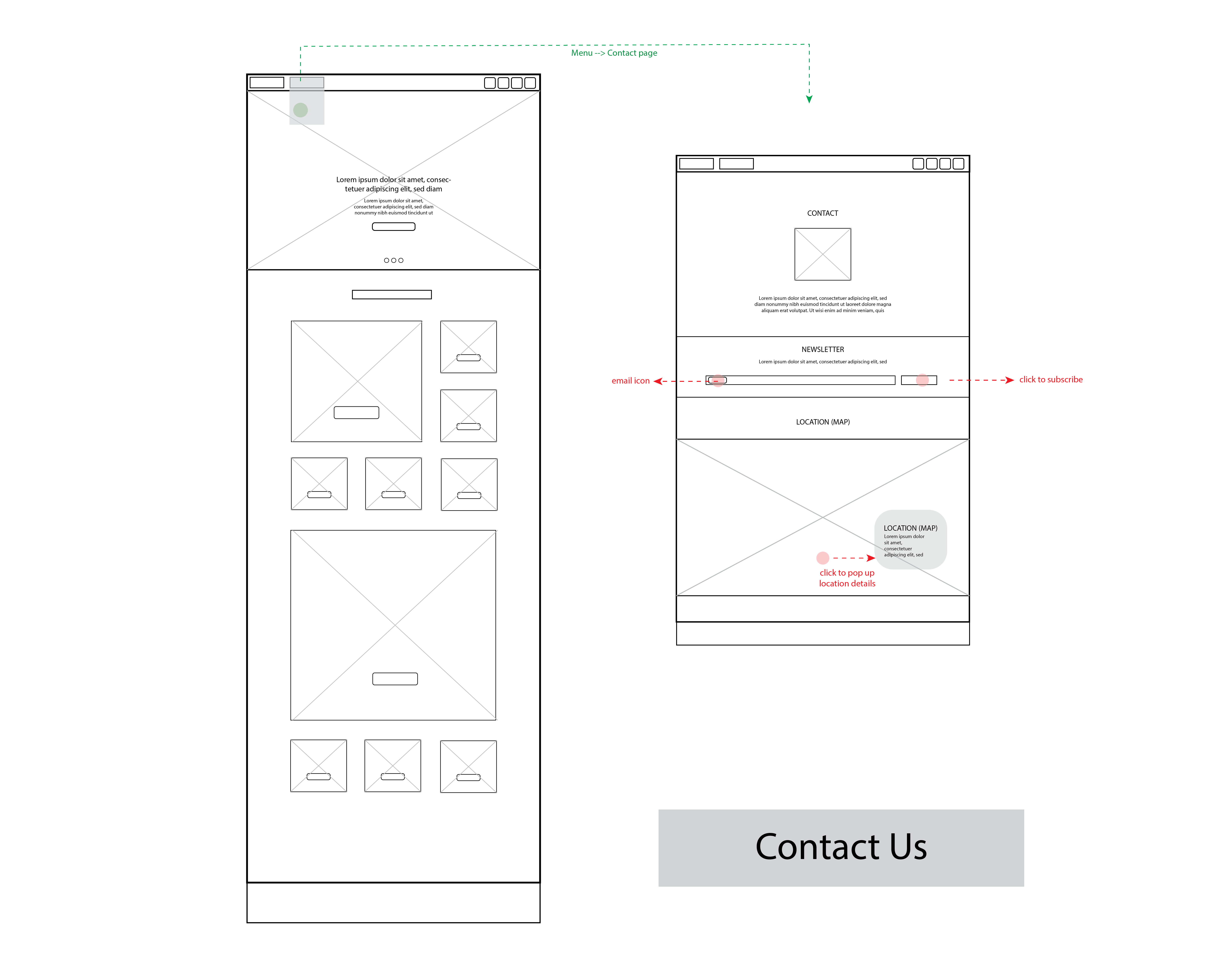
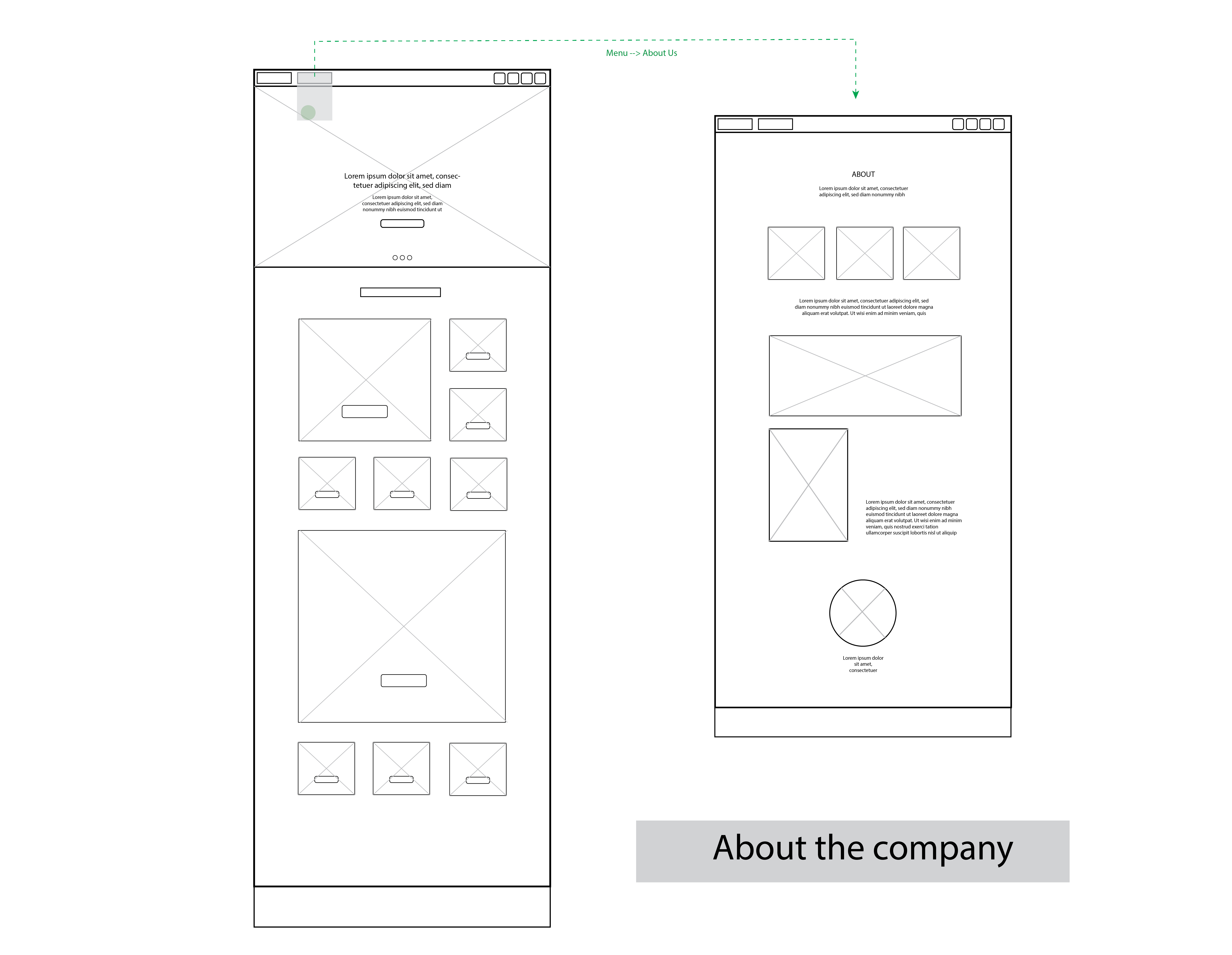
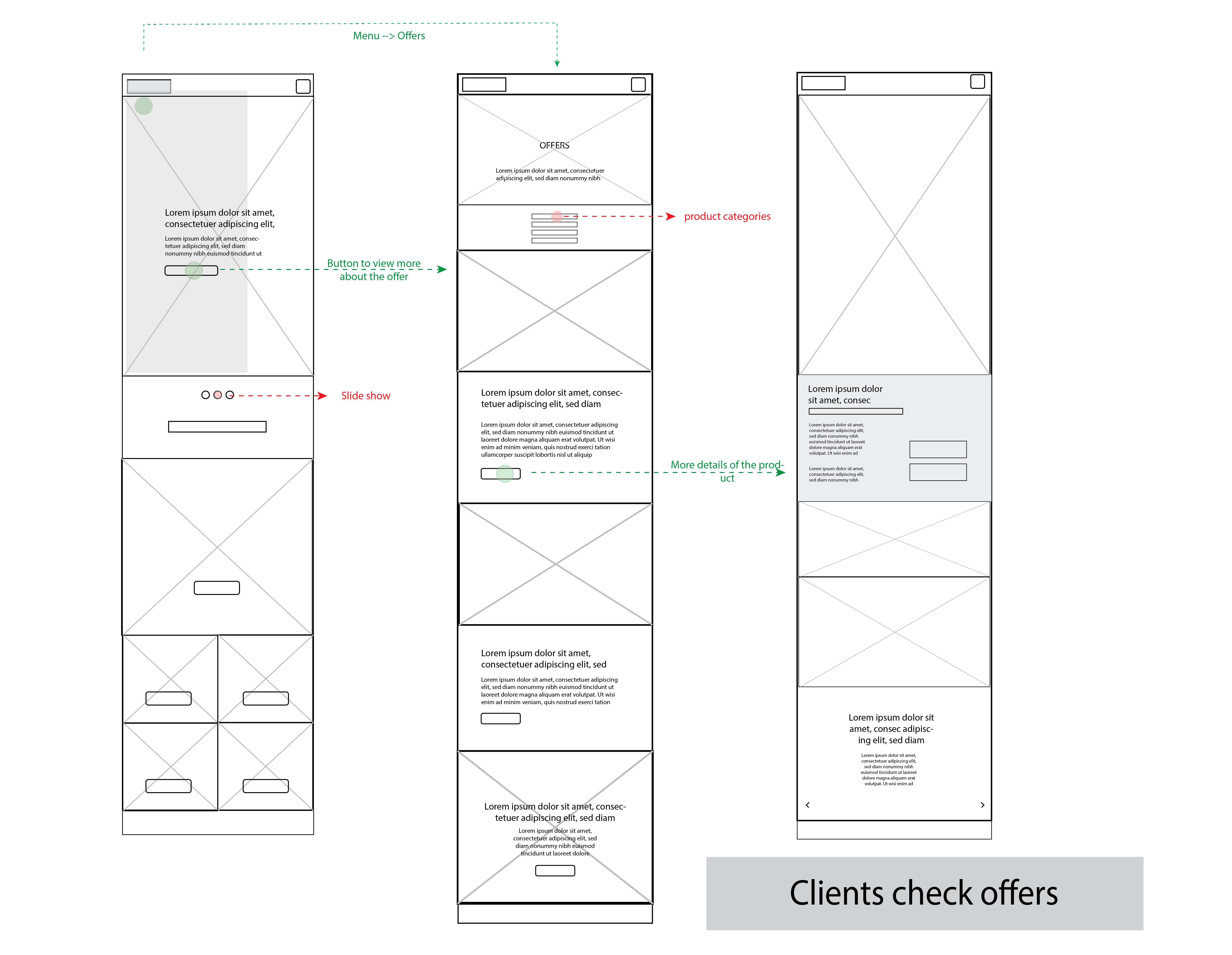
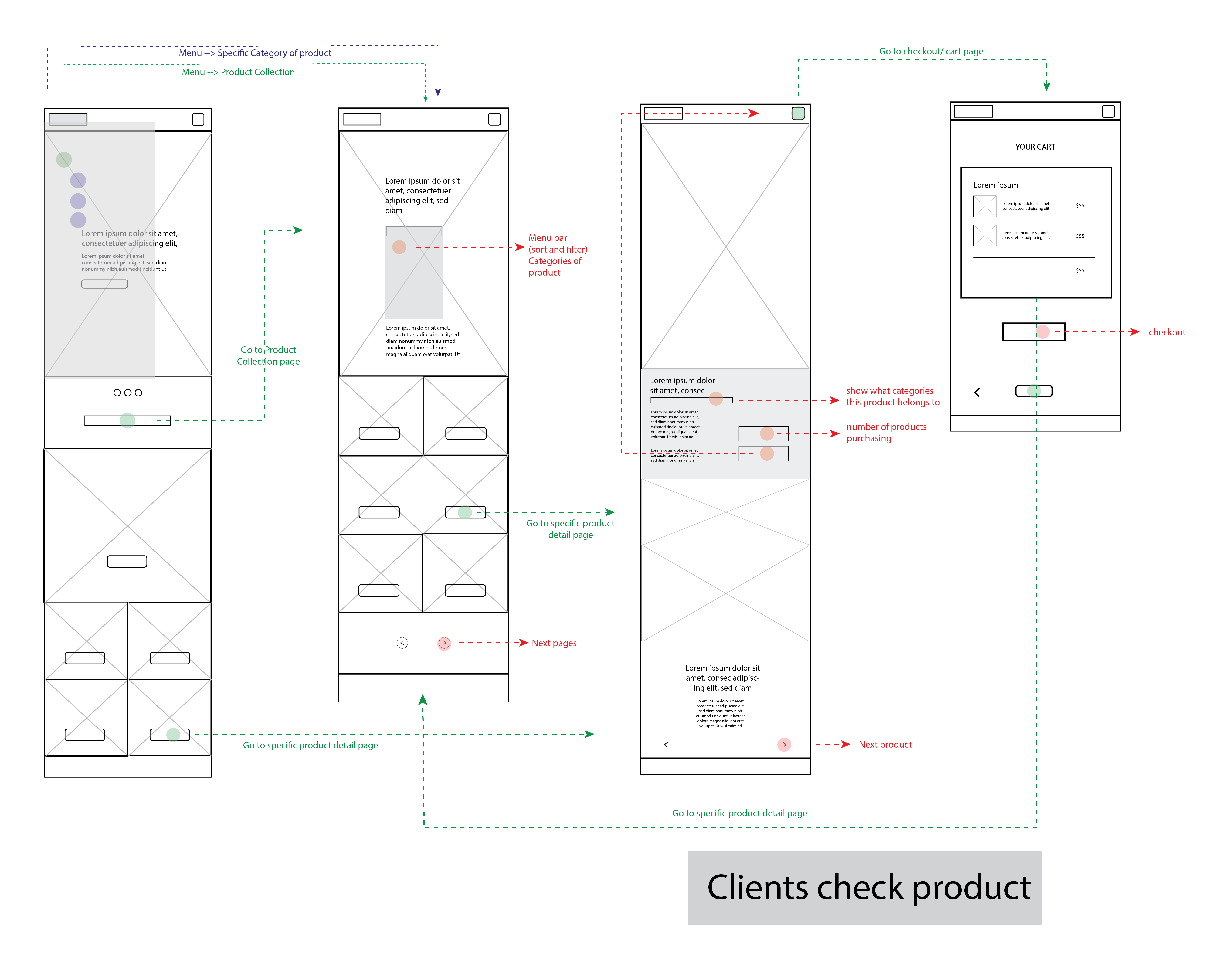
Wireframes
Images on the right/ below: initial desktop and mobile versions of wireframes — scroll horizontally to see more!
Possible Improvements: I should use more greyboxing to highlight the hierarchy in the website and also show what UI elements have the interactiveness.
Desktop
Desktop
Desktop
Desktop
Mobile
Mobile
Mobile
Mobile
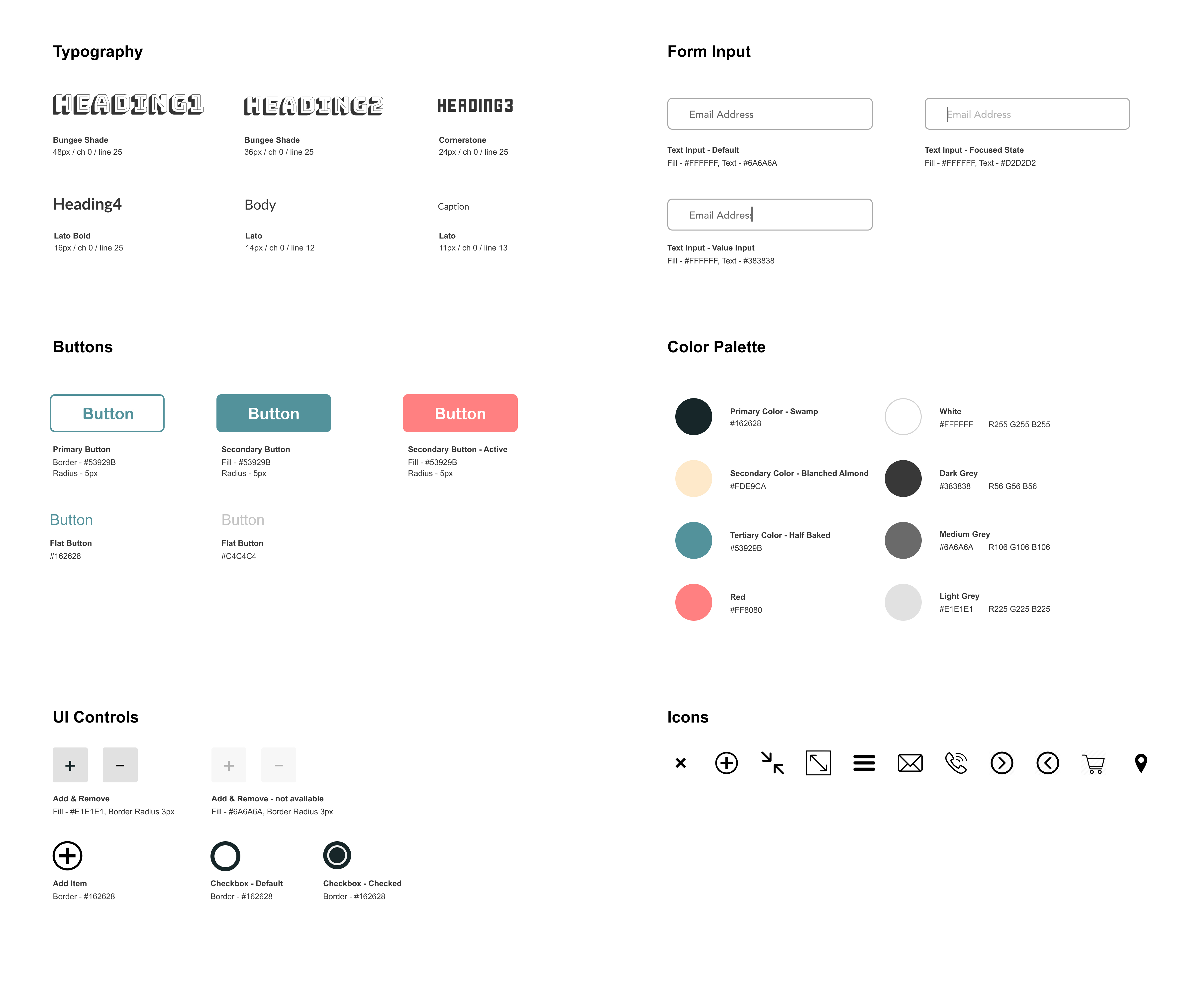
Styleguide
To match the art direction and styling in physical store, I wanted the website to look fun, retro, mysterious.
I used blue and navy as main color scheme which has a sense of depth and contrast with vibrant almond colour.
I selected unusual, fun fonts for headers and sub-heading. Even though it goes into the direction I wanted, I should be more careful on using it to show hierarchy as both fonts are uniquely attracting.
Styleguide for Vintage Maze website
Challenges in Development
One issue we found along the way is the amount and kinds of interactive elements. It was too much and not united in the whole webiste. We had to cut and re-think which are necessary and maintain consistent style from styleguide.
Style Consistency
I did most of the styling of the website. Since the project begins from my style guide, I lead the overall data selection and styling. We separate the work with Nicole focusing on building the checkout, about and contact page while I work on main navigation, homepage, shop and product page. This causes the inconsistency in layout styling and missing codes when merging css files. This major problem also collapses with the messy, unorganized, non-stated-used code.
How we solve:
We set the rule to comment the use of sections of codes in detail and specifically to keep each other on track.
After Peer Review:
We have feedback on the huge amount of colors and interaction effects that makes the site confusing and inconsistent. We take the advice to reduce colors and agree on effects used in hover and focus to make the whole website more clean and cohesive.
Sample UI: We create this on homepage for users to select the categories they are interested in. (with hover effect that aims to make the site more fun)
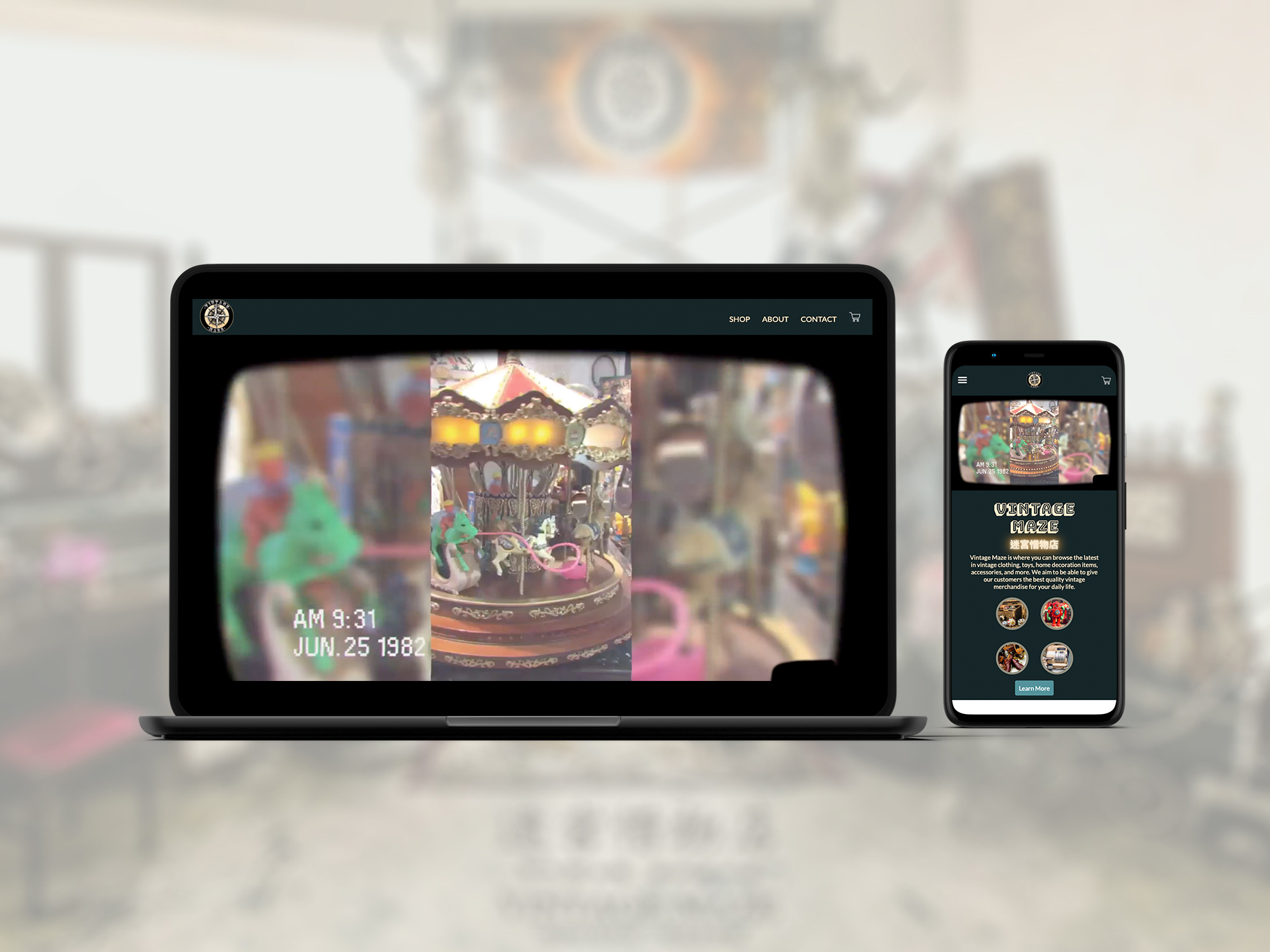
Vintage Maze
Vintage Maze is where you can browse the latest in vintage clothing, toys, home decoration items, accessories, and more. We aim to be able to give our customers the best quality vintage merchandise for your daily life.
For the design of product grid, each product has its’ name and price placed underneath the image. It also has a fast add into cart function.
Function:
Go into more details of the product --> click the image
Quick add the item “Add To Cart” button:
Desktop: Hover product--> quick add button popup
Mobile: Click (+) icon
A message alert will appear to notify users about the adding
Problem:
This is my initial design for desktop user, but this design might not work in mobile device as there is only tap in mobile and this one “tap” will forward to product detail page.
How I Solve:
I hide the hover button and show a small simple(+) icon inlined with the product name and price. By that, user can tap the (+) icon for quick adding into cart. To make this transition works, I set the minimum window size for the display mode of hover button, as well as the (+) icon to display none when hover button is working.
The most important thing working as a team is communication. Through this project, I believe "comment" for codes is crucial to let members to know the function of each to avoid confusion and keep the codes organized and easy to track. Styleguide is really useful and necessary to keep the style consistent and next time I should spend more time in styleguide to stylize all components to avoid confusion with teammate.